Beautiful Documents with Groff (Part I)
Stephen Ramsay
I haven’t deliberately used a word processor since the late eighties.
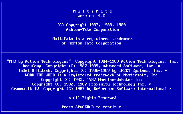
Of course, I’ve used Word here and there when I didn’t have a choice, but not since MultiMate—and before that, WordStar—have I intentionally sat down with full possession of my faculties and opened up a word processor in order to write something I care about.
Okay, not quite. I went off to college in 1988 with a typewriter that sort of had a screen and sort of behaved like a word processor. I suppose today it would be regarded as a “distraction free” writing device along the lines of the very chic and absurdly expensive stuff made by FreeWrite, though since it exceeded the clamor of an actual typewriter, it tended to distract (i.e., wake up) everyone in the dorm. And I suppose there was a brief period at the beginning of grad school when I was using some kind of word processor on a very old—and I think, second hand—pre-OS-X Mac laptop, though I can’t recall what that program might have been.
But the truth is that the minute I heard about Linux, I immediately wanted to switch to that. I had been using commercial Unixes—aix, Solaris—at the various part-time (and later, full-time) jobs I had in grad school and just loved it. At the time, however, Linux didn’t seem to have a word processor (I’m sure it actually did). What did people use to write documents? When I asked someone at the local Linux Users’ Group about this, they told me about LaTeX. And that began a very long love affair with typesetting in general and TeX in particular. I have used some variation of TeX/LaTeX to write pretty much every paper, every article, every talk, every letter, every slide, and every lecture I’ve written for the last twenty-five years.
One of the pleasant side effects of this is that I can still read all the stuff I’ve written since the mid-nineties. In fact, I can usually still compile it into something that can be displayed or printed (dvi, Postscript, or pdf). And honestly, after decades of using it, the “code” rarely gets in the way. I’m so used to writing this way that I sometimes start writing LaTeX when the format I’m supposed to be using is html or Markdown. In fact, I find it really hard to work in a regular word processor, not because of any actual aversion, but simply because I am constantly hitting the key sequences for Vim in order to enter the styling commands for LaTeX. And that’s another thing I’ve been doing forever: writing everything in Vim.
But the real reason I stuck with it had more to do with a weird quirk I have as a writer (that I suppose started when I was introduced to TeX). In order to assess whether the thing I’m writing is good or not, it’s important for me to see what it would look like as a real book (or letter, or article, or whatever). It’s true that I love typography, page design, and all related matters, but I suspect it’s also a sort of psychological trick I’m playing on myself. If it looks real, that makes it more likely that it will one day be real. As in, finished. As in, published.
So the first paragraph or so of the book I just wrote looked like this when I was composing it:
\chapter{Textual Behavior in the Human Male}\label{textual behavior}

\textsc{My title,} of course, refers to the infamous Kinsey Report:
\emph{Sexual Behavior in the Human Male,} first published in 1948.

The Kinsey report is, like \emph{Harry Potter,} \emph{The Omnivore's
Dilemma,} and The Book of Job, one of those books you feel you've read
even if you haven't actually read it.  Its general outlines and
conclusions, and the national sense of scandal that ensued, are well
known even after sixty years.  When you do sit down to read it, though,
the most shocking thing isn't its prurience or its candor, but its easy,
approachable tone.  It sounds like this:
That’s what it looks like in Vim (more or less). But when I “compile” the document, it looks like this:
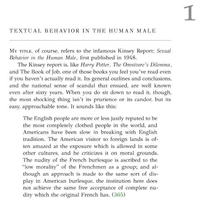
Now that’s starting to look like a book! 1
Yes. Fussing with typography is an excellent way to procrastinate, but then again, I have published a fair amount of stuff, and … well, this is my “process,” you see. 2
There are a couple of problems with this process, though. One is that no humanities publisher that I’ve ever worked with will accept submissions in LaTeX. I wouldn’t expect them to do so. Publishers in stem fields often do because of LaTeX’s vaunted ability to produce really nice looking mathematical formulas, but such publishers typically provide very strict templates to their authors. In general, humanities book publishers like to employ actual book designers to do actual book designs, and those designers really prefer to start with as little formatting as possible. This all makes complete sense to me, and even though I’m a dab hand with TeX at this point, I would never confuse myself with a professional designer.
So that’s one problem. When the book (or article, or whatever) is done, I’m going to have to convert it to something else, and that “something else” is almost always Microsoft Word. Again, I have no substantive objections to this, but it’s kind of a pain. There are converters that can get you most of the way there, but I’ve never found a tool that can go from my lovingly formatted LaTeX to a publisher’s lovingly insistent style guidelines without having to make a great many interventions by hand.
The other problem only appears with long-form material, but it had finally started to annoy me. LaTeX, you see, is slow. If you’re writing the way I do, you’re essentially introducing a compile step (already an intolerable thing for most writers, I suspect, and the whole reason for word processors in the first place). But if the compile is taking, say, a minute or more, it really starts to feel like it’s interrupting the flow.
But what’s a writerly nerd to do? No word processor that I am aware of produces documents as pretty as LaTeX; you’d have to use InDesign or something like that. And what’s more, the price of all this beauty is a really tedious conversion process at the very end.
I wasn’t looking around for a solution to these problems, really, but I managed to stumble on one. Joshua Stutter—a grad student in musicology at the University of Glasgow and, as I later discovered, a co-religionist in digital humanities—was procrastinating as I do, and had written at some length about the experience of writing his thesis in groff.
In what now? You mean that thing for creating unix man pages? That’s the only thing I’d ever used it for, and that use case seemed to have nothing at all to do with beautiful documents.
What I didn’t realize, however, is that Roff is a bit like TeX, in that it gives you a set of low-level primitives for creating higher-level macros. The codes for writing man pages are one such set of macros, but there are others. Including the rather elaborate “mom” macros.
The mom macros (I had never heard of them) are basically those macros that are intended for creating beautiful long-form documents (in pdf or Postscript) for display, with an emphasis on the sort of things fiction writers and humanist scholars need to do. It even uses mla form as its default reference system! What does it look like? Here’s a page from the book I’m writing right now:
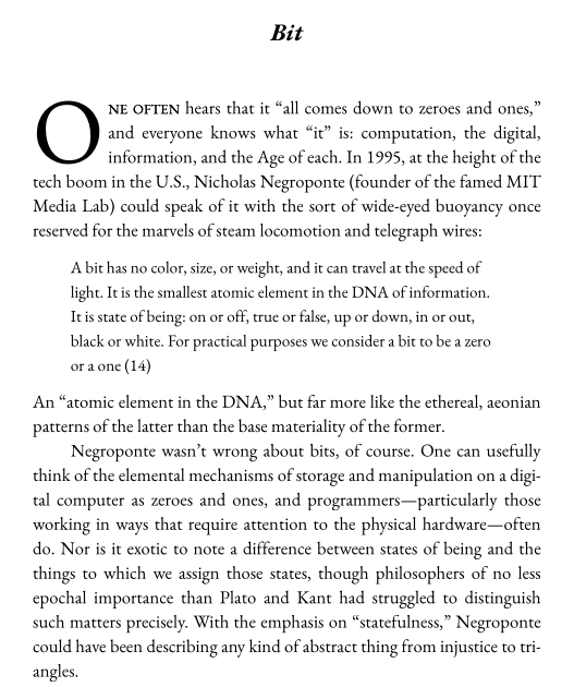
Is that a drop cap? Why yes it is!
I think this looks lovely, and so far, mom hasn’t let me down. It’s true that I don’t typically need to do anything terribly complex, but I insist on having full control of all fonts (the above is in a Garamond I quite like), and I absolutely must have: small caps, curly quotes; true hyphens, en-, and em-dashes; dingbats, fleurons, and other common ornaments; dot leaders (if I’m in the mood); text, hanging, and lowercase figures; the ability to set the leading manually; a good kerning algorithm; dynamic ligatures; true ellipses … well it’s rather a long list, now that I think of it. Oh, and I also need lots of different alphabets. Classical Hebrew, polytonic Greek, and Cyrillic fairly often, as well as all the diacritics and letterforms of all the European languages ancient and modern. Oh, and math. And mom does all of that. 3
Using groff instead of TeX might seem like just a bit of techno-hipsterism—like a preference for vinyl records or recumbant bicycles. And really, since groff is a bit dorky even among those already prone to dorkdom, it might be more like a preference for wax cylinders and unicycles. What’s more, the groff ecosystem (if that is even the right word) is way smaller than TeX. I just installed TexLive on a pretty zippy Linux laptop, and it took over an hour. Mom is surprisingly extensive (and extensible), but it hardly compares to the hundreds (thousands?) of templates and packages available to TeX users.
But here’s the thing: It’s fast. Like really, really fast.
It did not, however, address my first problem, which is the conversion from beautiful documents to unadorned Word. I’ll discuss my glorious solution (read: my procrastinive peregrinations) to that problem in Part II.
Keywords: LaTeX, groff, mom, typography, writing
-
That’s the gorgeous ClassicThesis package by Niels Olof Bouvin—a homage to the graceful design of Bringhurt’s The Elements of Typographic Style. I hadn’t come across it until I started working on the book.↩︎
-
In some sense, it really is my process. I procrastinate with writing like everyone else. The difference is that my favored method of procrastination is to go write some code that improves my environment (sort of a very elaborate variation of rearranging the stuff on your desk). But using computers in this way nearly always makes me want to go write something … about computers!↩︎
-
Actually, unicode support is one of
groff’s most mysterious blind spots. In fact,groffitself doesn’t actually support unicode; you have to pipe your output into an included tool calledpreconv, and honestly, it could be better.↩︎